When displaying grouped data, especially continuous data, a histogram is often the best way to do it – specifically in cases where not all the groups/classes are the same width.Histograms are like bar charts with 2 key differences:
There are no gaps between the bars, and
It’s the area (as opposed to the height) of each bar that tells you the frequency of that class.
1 of 4
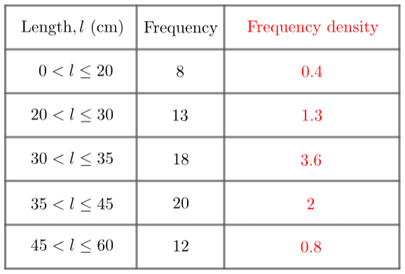
How to find the Frequency Density
In order to make this work, when drawing a histogram, we plot frequency density on the y-axis rather than frequency. The frequency density for each group is found using the formula:
Frequency Density = Frequency/Class width
2 of 4
Example
3 of 4
Finding Frequency
To find the frequency from a histogram you find the area of the bar
Comments
No comments have yet been made